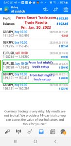
Forex Smart Trade Results, Friday, January 20, 2023 – $4,892

Forex Smart Trade Results, Thursday, January 19, 2023 – ($13)
February 4, 2023
Forex Smart Trade Results, Monday, January 23, 2023 – $3,886
February 8, 2023Types of Price Charts.
Let’s take a look at the three most popular types of price charts:
- Line chart
- Bar chart
- Candlestick chart
Now, we’ll explain each of the forex charts, and let you know what you should know about each of them.
Line Chart
A simple line chart draws a line from one closing price to the next closing price.
When strung together with a line, we can see the general price movement of a currency pair over a period of time.

It’s simple to follow, but the line chart may not provide the trader with much detail about price behavior within the period.
All you know is that the price closed at X at the end of the period. You have no clue what else happened.
But it helps the trader see trends more easily and visually compare the closing price from one period to the next.
This type of chart is usually used to get a “big picture” view of price movements.
The line chart also shows trends the best, which is simply the slope of the line.
Some traders consider the closing level to be more important than the open, high, or low. By paying attention to only the close, we ignored price fluctuations within a trading session.
Here is an example of a line chart for EUR/USD:

Learn to Day Trade Forex
If you’d like to earn extra income trading on the Forex market, consider learning how to currency trade with Forex Smart Trade. With their super-accurate proprietary trading tools and best-in-the-business, personalized one-on-one training, you’ll be successful. Check out the Forex Smart Trade webinar. It shows one of their trader’s trading and how easy, intuitive, and accurate the tools are. Or try the Forex Smart Trade 14-day introductory trial for just TEN dollars.


